Monday, February 29, 2016

This panting was done by Silvia Pelissero. What I like about Pelissero art work is that she uses alot of color. She is able to use dark colors and light colors and is also able to blend them all.

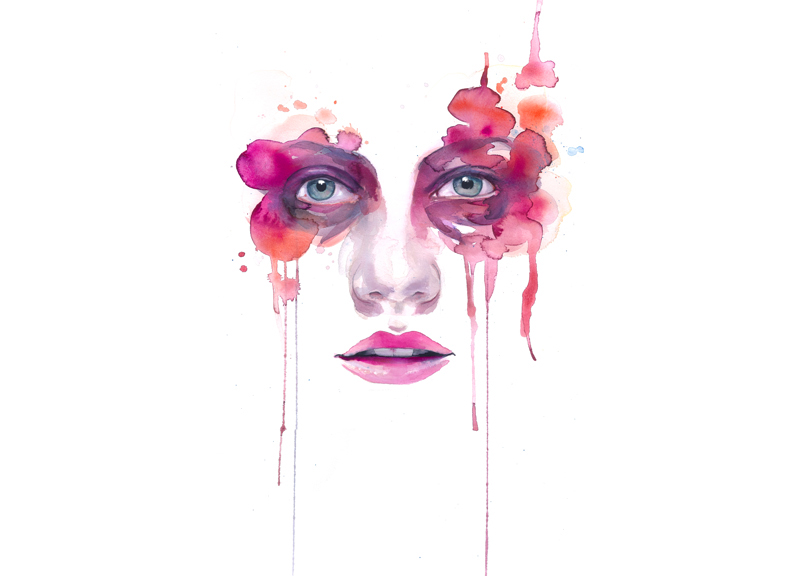
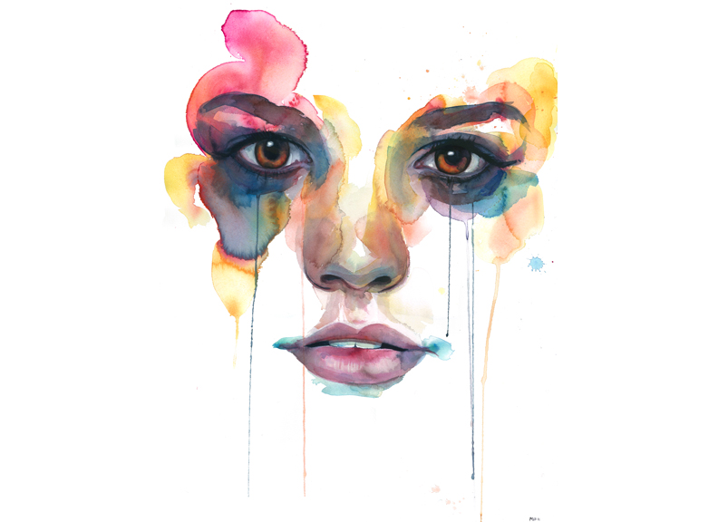
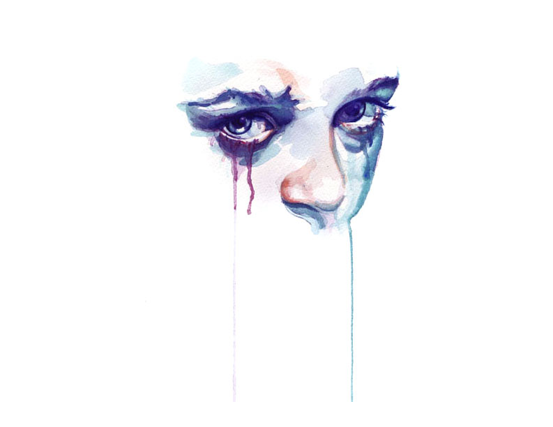
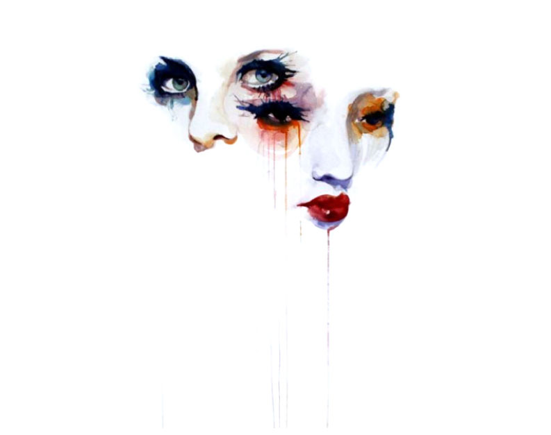
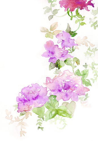
Some things I will be taking from Jean Haines is not outlining. Painting very smoothly and mixed color and different layers. And what I will be taking from Silvia Pelissero is the  veriety of colors and using dark colors and being able to blend them in a sense.


This elephant was done by Jean Haines. Something I like about this artist is the fact that there is no outline. His art work is like faded in a sense but can still see alot of unique detail.

Friday, February 26, 2016

Alexus Caliz

My two artists are Birgit O'connor and J.M.W. Turner . Birgit O'connor is a professional self-taught watercolor artist that has been painting for over 20 years. Her speciality is floral, nature, and landscape paintings. Birgit sees her watercolor paintings as reflective of nature's voice. I find myself really engaged in O'connors artwork due to the complimentary and contempory colors. Turner is commonly known as "the painter of light" and his work is regarded as a Romantic preface to impressionism.Turner is also one of the greatest masters of British watercolur landscape painting. I am going to take the sunset colors from turners "The Scarlet" and taking the mountains from O'connors painting by creating my own landscape portrait.
 

Watercolor artists

Stan Miller


I choose Stan Miller  who is a  proffesional watercolor artist.


Miller creates very realistic and detailed portraits which I would like to incorparate in my own work.

old-man-portraits


James McNeill Whistler


James Mcneill Whistler was a watercolor artist whos paintings consisted of portraits and minimalist

 seascapes. Whistler used natural and spiritual domains in his art and monocromatic colors.


Thursday, February 25, 2016


Lucile Prache: She's one of my favorite watercolor illustrators because of her creativeness with colors and details. I like how not only does she illustrate food but also fashion and architecture. I can definitely tell that she puts her all into her artwork. I'm going to take the light abstract colors from her to use for my water color project.


Katie Rodgers: I really love her watercolor paintings/illustrations because of how vivid they are. I also find it pretty amusing how she's all about the fashion and details! I think that I'll only be using details of my own but inspired by her.


Marion Bolognesi and Abigail McKenzie


WatercolorArtists


Marion Bolognesi - http://www.marion-b.com/index.php?/paintings/sneak-peek/
The reason for picking this artist is because the way she expresses her paintings and find it very interesting the way she puts emphasis on the eyes and the blotches around them. Going to incorporate the blotches into my own water color paintings and a few a details that I may add as well.


Abigail McKenzie - https://www.flickr.com/photos/abigailmckenzie/3384968670/in/set-72157615799092143
 The reason for picking this artist is because the way she painted her flower and the way she made it look faded. Going to incorporate the way she faded her flowers into my water color painting.
floral | by abigail mckenzie illustration


My first watercolor artist is:

Maruti @maruti_bitmin

Maruti is on of my favorite twitter artists!
Her use of blank space and color really make her paintings special and recognizable.
Usually her art revolves around wildlife and plants.


see her tictail shop for more: http://koyamori.tictail.com/
 
My second watercolor artist is:

Maung Maung Gyi

 A painter from Yangon and the first Burmese to travel abroad for studies in Western painting.
His paintings have a tendency to look extremely detailed, yet still rough and almost rushed, but in a way, it really harmonizes his paintings.


Wednesday, February 24, 2016

Joseph Stoddard
  • Why do i like this artist: The reason why i like this artist is because he paints a lot of architecture and nature.
  • What will i take from their art: I will take his subject matter from him.

Blule
  • Why do i like this artist: I like how she doesn't have totally defined lines in any of her pieces and they represent a part of my childhood

  • What will i take from their art: I will be taking the non-defined lines from her.

John Marin and Milford Zornes

John Marin: What I like about this artist is that he draws so simple.


Milford Zornes: I like the colors that he uses


Edward Hopper: I like that he would paint pictures of real places in life such as his house where he lived. He also drew a picture named the Nighthawks which was of people at night in a dinner. I would incorporate real life things or people in my drawing that im going to create.


Jamie Wyeth: I like that he uses dark colors in most of his pictures making them seem very serious and old. Most of his paintings seem scary because of the simple colors he uses and serious faces on the people. I might like to encorporate a character or object in my painting as he has done in all of his paintings.


Dong Kingman
 (1911-2000)
  • Why I like this artist: Has realsitic settings in his paintings and includes a lot of color and detail.
  • What I will use from them: Use of detail.
         

John LaFarge
 (1835-1910)
  • Why I like this artist: The pieces are simple yet powerful with sublte colors. 
  • What I will use from them: Use of soft, pastel colors.
 

Tuesday, February 23, 2016

Aaron Apsley & Kate Boyington

Aaron Apsley
What caught my eye
  • use of value, makes it look almost realist
  • detailed


Kate Boyington
  • textures created with watercolor
  • use of values


I will be taking the use of values and the textures
 

Watercolor Artists

My first watercolor artist is named Andreea R. She has a lot of paintings involving animals and nature, but my favorite part of her paintings is the fact that they really have no concrete outline. They're messy, but you still know what it is that she is creating. I will be taking that aspect from her art, the whole "messy-but-still-noticeable" aspect.


My next watercolor artist is Kate Schultz. Her art has very creative element to it. You could see both nothing and something within the same picture all at once. Her artwork is very all over the place, there's no definite design or end product that she is going for. Yet, it all seems to come together. I reall appreciate how she just goes with it and creates something out of the many colors she uses, she doesn't paint something specific, and that is the aspect of her art that I will be incorporating into mine as well.


WaterColor

Paul Klee
  • Im choosing this artist because i liked the way abstract was used in all the paintings that he painted.


Georgia O'keeffe
 
  • Im choosing this artist because i liked the way intense color was used in all the paintings.
Im taking the Abstract and intense color from both of these artists.


Vincent Van Gogh

The deep colors and the outlines for the boats.


Eliot O' Hara

The blending of the colors and blotchiness in the grass area along with the mountains in the back.